I have been using my pocket color wheel this week on my abstract paintings. It is so cool! For mixing colors you select a color on the outside wheel and align it with a color on the inside wheel. The mixture appears in the window. It is also great for when you are thinking about value studies.
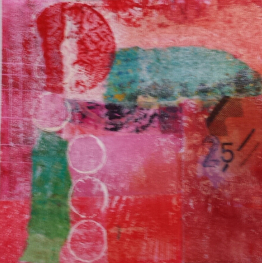
But I like it best for the other side when thinking about a color scheme. You can have lots of fun trying out these combinations…complimentary colors…most people think of green and red. Split complimentary is choosing one color and using the color on each side of its compliment on the color wheel. In the case of red this would be blue-green and yellow green. Then there is Diad, Triad and Tetrad. Do you like the color combination I used in this abstract picture from yesterdays 30 paintings in 30 days?
If you look back at my September 9th post you can see a picture of the color wheel I use. It has two sides.


